Feature
Activity Tracking (DonorDrive)
Designing a new workflow for fitness app API integration.
Designing a new workflow for fitness app API integration.
DonorDrive offers enterprise level fundraising tools.
Users use a fitness app to track data and don't capture it in DonorDrive.
More integrated UX, and less money spent on a third-party product for this experience.
UX/UI
1 PM, 2 Back-End, 1 Front-End, 1 QA, 1 UXR
Solution discussion, support research, designed hi-fi prototype for QA and front-end.
During the pandemic, nonprofits had to identify workarounds to the way they fundraise. For example, 5k walk/run fundraisers are an in-person event, but had to shift to a digital experience. Hence, DonorDrive established a new product that mapped the 5k walk/run fundraising experience. The product transferred fitness app activity data to the DonorDrive platform. The platform converted the activity to a unit of distance. Fundraisers promoted their progress and their friends donated. DonorDrive used as third party vendor to transfer the data between the apps and the platform. Once DonorDrive established an app, they wanted to establish their mechanism for transferring data. As the mobile app included this feature, my role for this was to focus on the web experience.
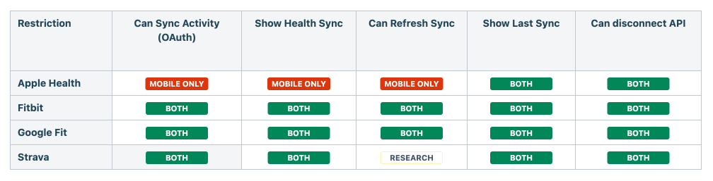
Our PM team identified 4 of the most popular fitness apps that our users used: Apple Health, Fitbit, Google Fit, and Strava. The goal was to leverage their APIs to transfer their activity data to our platform. The challenge was that APIs comes with some limitations. These limitations impact our product's experience. Additionally, my limited scope restricted the design to a specific part of the page (more on this later). Lastly, I had to mirror the tasks/design goals in the mobile app for the web experience: (1) users can integrate 1 fitness app at a time, (2) users know when data was synced, and (3) users can prevent connection issues.
The web experience’s workflow had to mirror the mobile one.
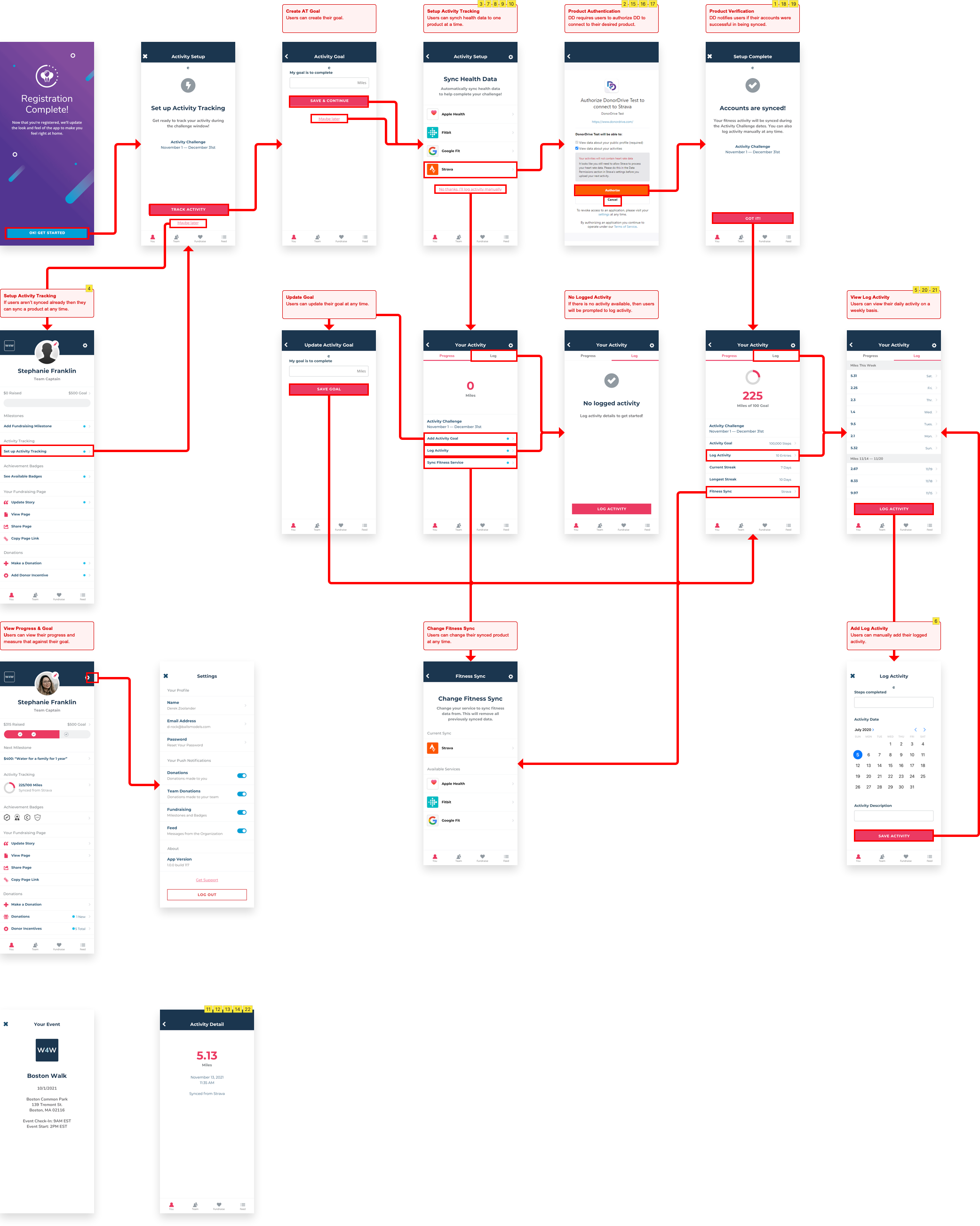
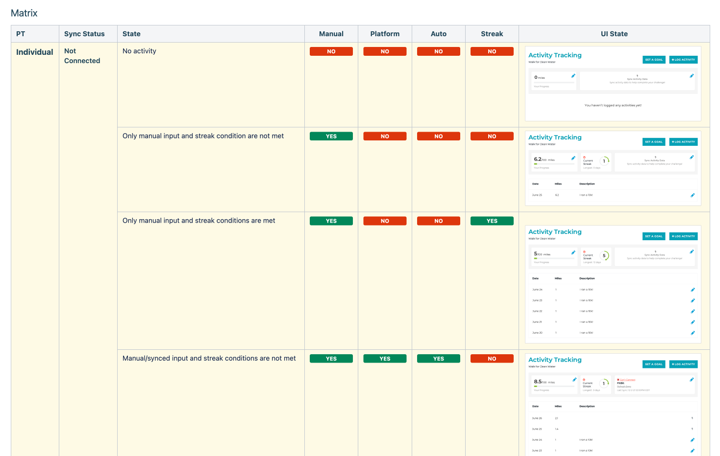
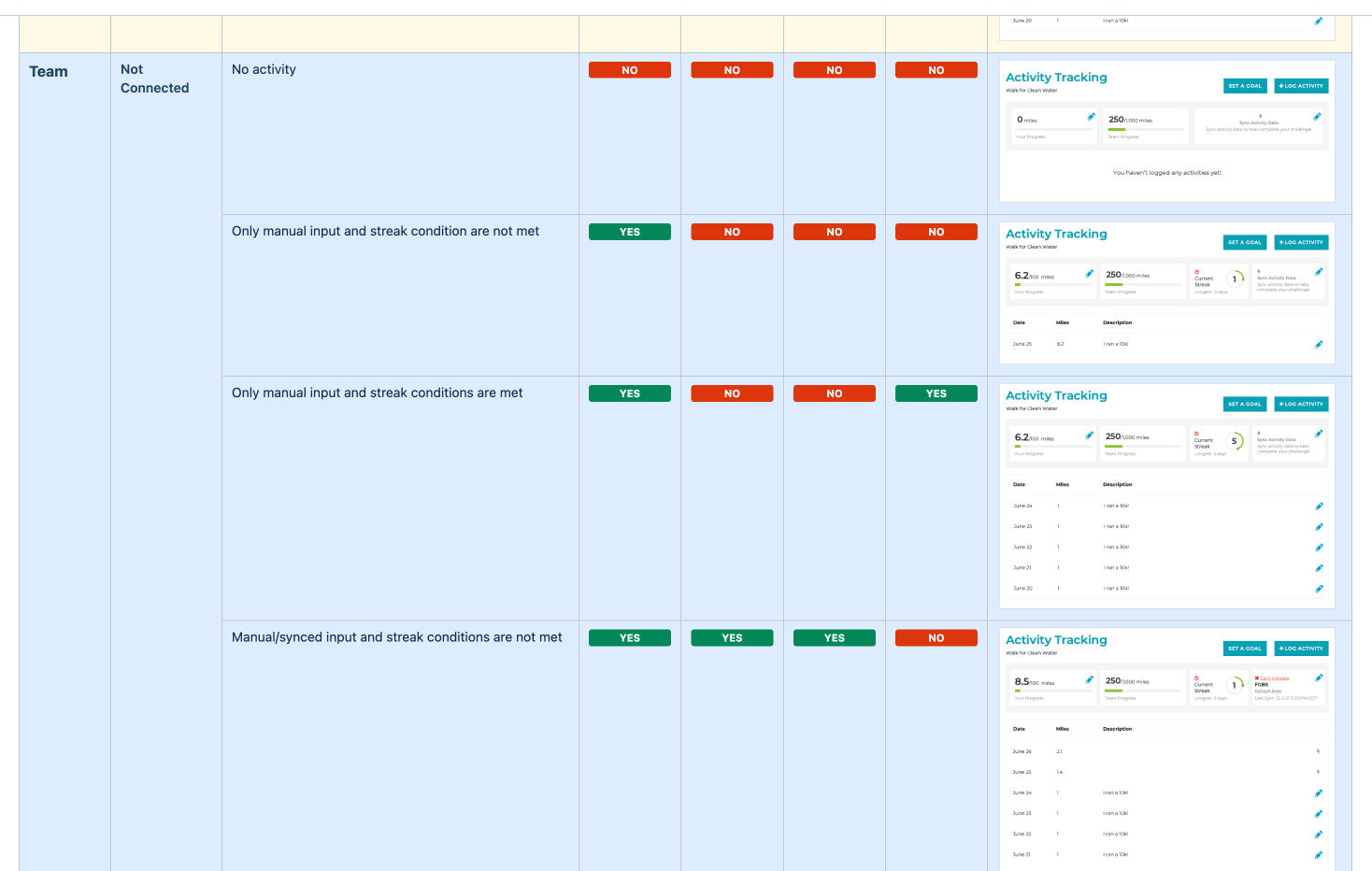
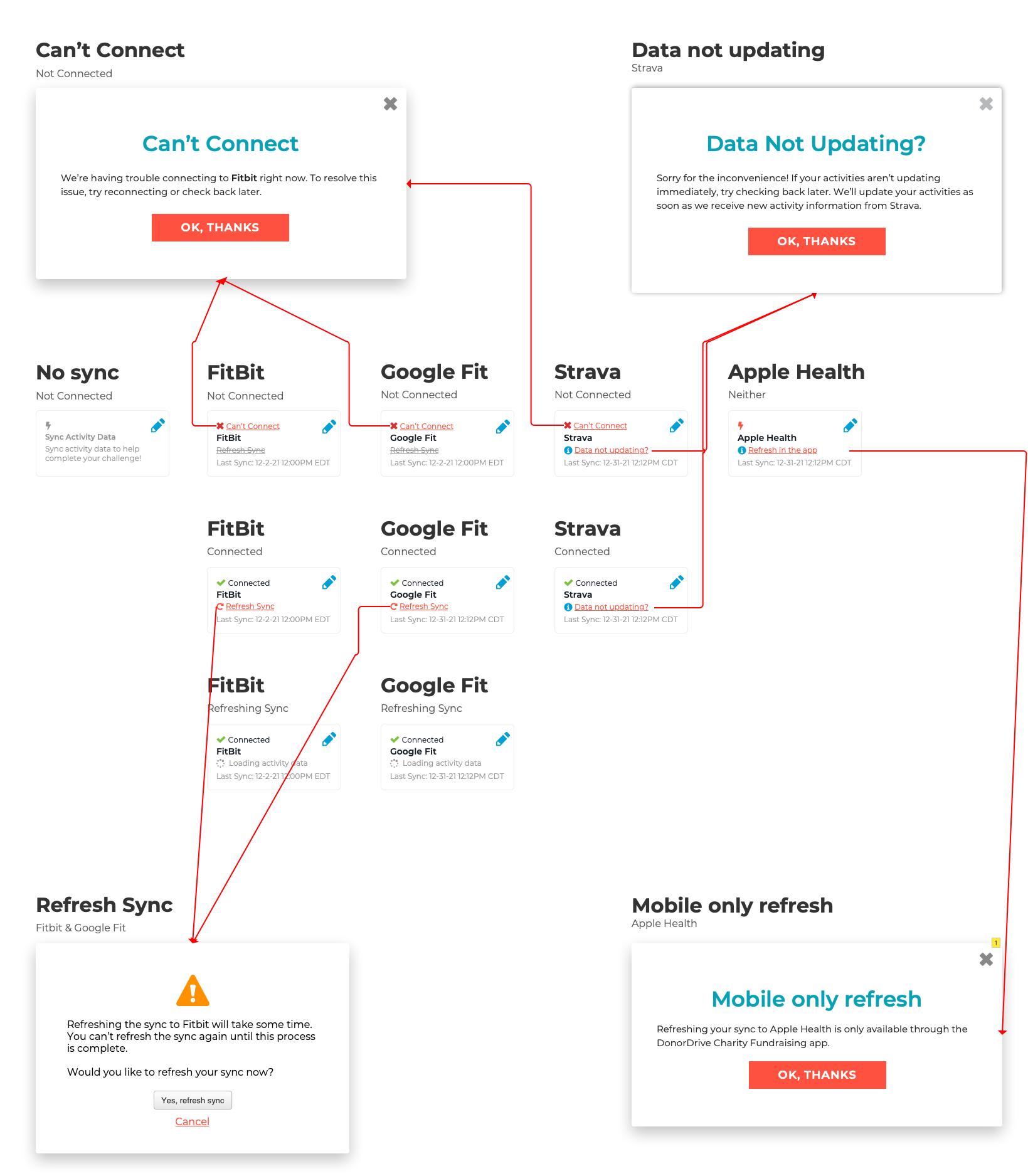
Two things I noticed upfront: the "states" and the complexity of designing for web. A "state" is the current experience's status. Communicating to the user which app is connect is one state. Signifying if the connection is healthy is another. What's more complicated is that there was a state for an individual and team profile. It was important for us to document each of these states so we could flag any unhappy paths as early as possible.
Also, each product and their own limitations on sharing data. It affected functionality and visual treatment. For example, Apple Health did not provide as much access to data for a web platform in comparison to the mobile one.
The design's scope was deceptively simple: insert the signifier/affordance in this container.
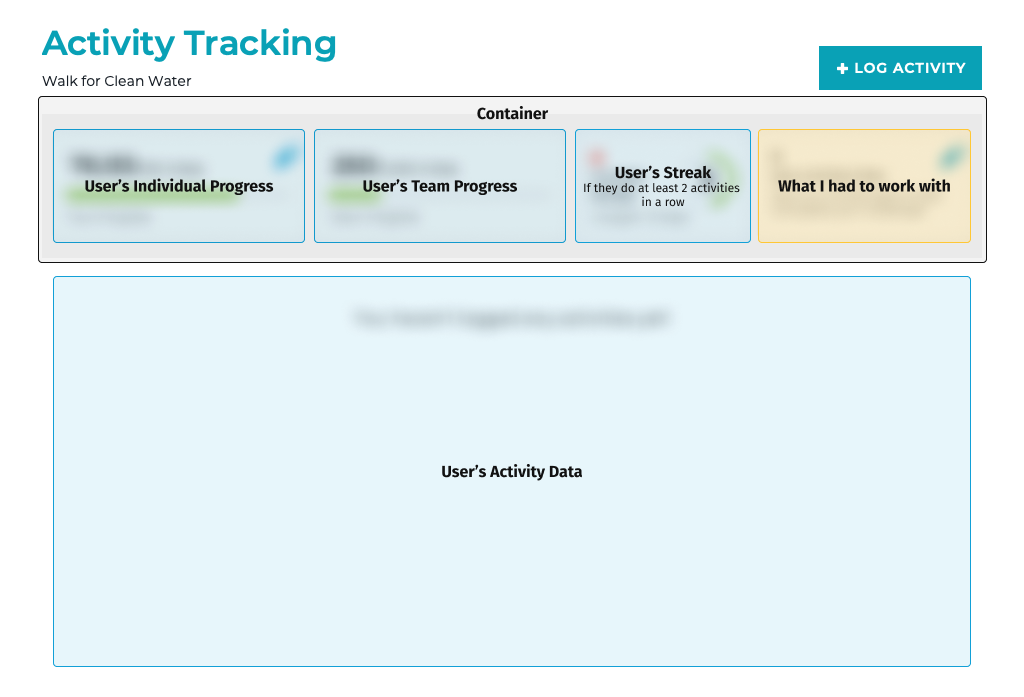
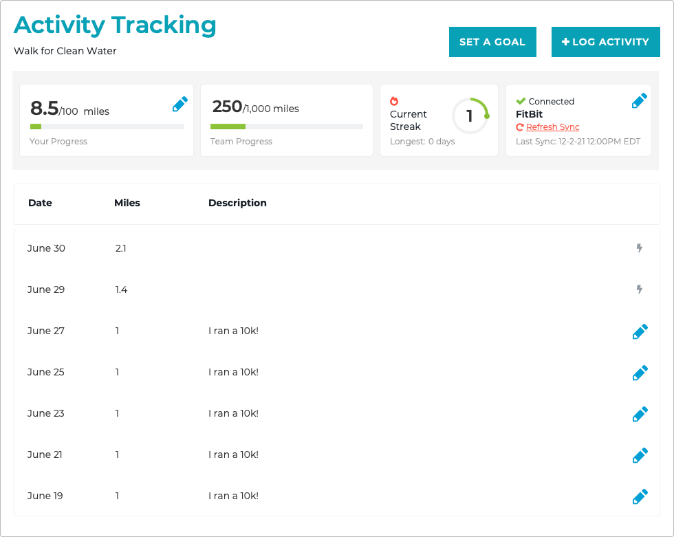
One of the considerations for this design was exploring space. What is the most important thing users need? What tasks can happen outside of this container? Unfortunately, we didn’t have data to identify the necessary info on this screen. Hence, I leveraged design heuristics: displaying status, preventing errors, minimalist design, and providing help. So in the design I wanted to show status at all times, and have them leave the screen via a modal to do the task. Using the status info I discovered earlier, I wanted to show: the product name, whether or not it's connected, when the data was last synced, and an action to resovle status.
As for designing the actual tile, my approach to UI is to design for a specific task or goal. Then prepare iterations for presentation. I like to go over the pro’s and con’s for each idea. I find it helps align the team's goals and identify technical trade-offs upfront.
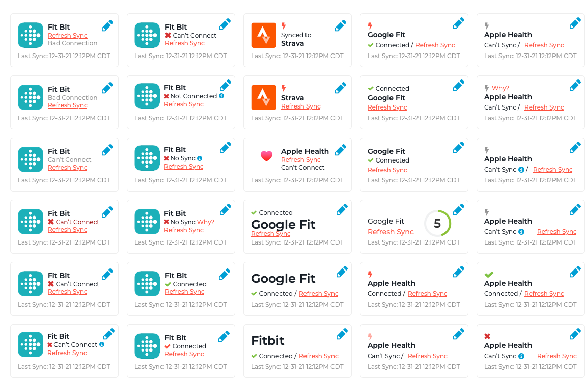
We ended up with this tile design. We needed something that was responsive, maximized space, but didn’t sacrifice accessibility. Since the other tiles were conditional, the tile spanned the width of the container. While we liked the logo for increasing scannability, we prioritized space for accessibility. Also, it kept design consistent because each product had different brand guidelines.
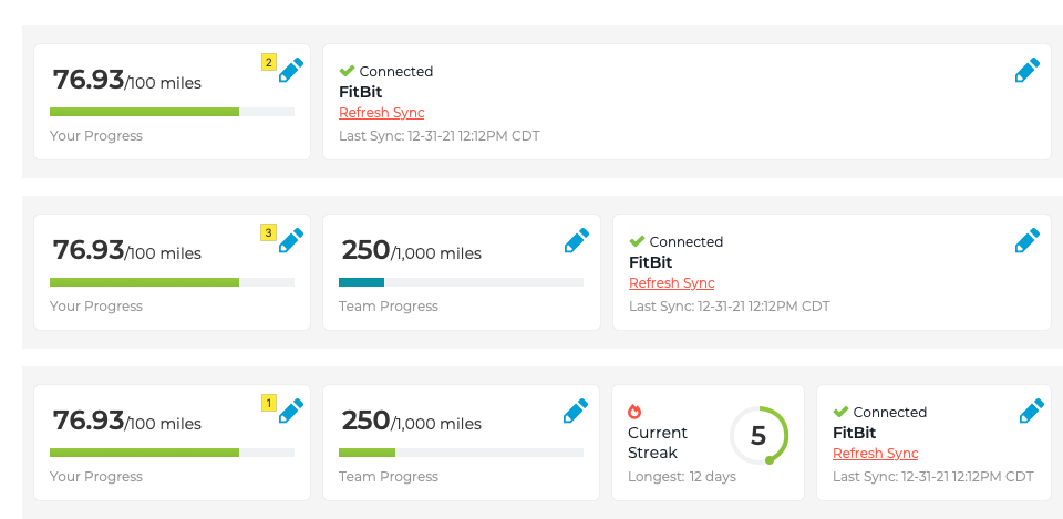
As for the actual web workflow, it was like the mobile one. One of the differences was that we wanted to guide new users through a wizard. The other difference was providing users access to "refresh" their data collection. Since we could only do once-a-day updates, we wanted to give users control to update their page sooner.
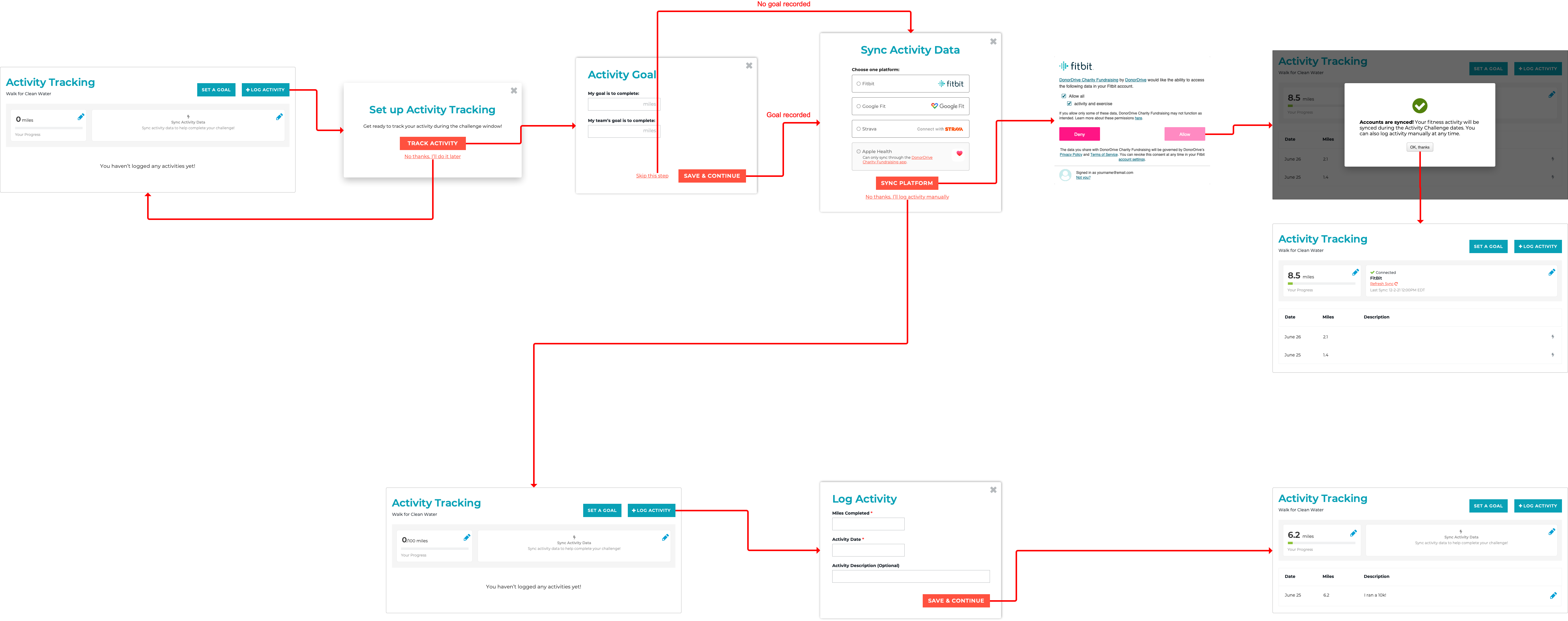
I supported our UX Researcher in 2 unmoderated usability tests. The goal for each was to validate the aforementioned goals. In the first round, we got lucky and all the goals were validated. The main feedback we received was phrasing the copy in our wizard. This was iterated for the second which was also validated. Ultimately, this feature was successfully launched.
Throughout the project we kept running into specific limitations for each API. As a solution, it was helpful to break it down in a table format to show the differences between each. Unfortunately, we kept discovering new differences throughout the project. For example, each product had its own guidelines on how to handle its logo. I depended a lot on my technical teammates to communicate where discrepancies lie. However, the API documentation was available to me. I should have spent more time reading through this material. Although the technical details escape me, I knew that my design perspective was valuable. My contribution could at least help flag anything as it relates to design (and conversely affect technical scope).