Marketing
Suicide is Different
Matching the crisis intervention experience for third party supporters.
Matching the crisis intervention experience for third party supporters.
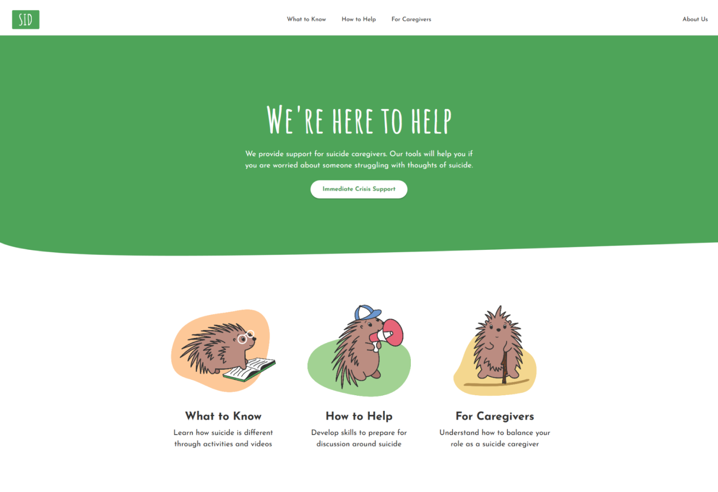
Suicide is Different (SID) offers crisis intervention education for people who want to help.
Users were not learning through the intended 5-step module.
Improved crisis intervention experience, updated UI and developed on Squarespace.
Product Manager, Lead Designer, and
Squarespace Developer
1 Researcher and 2 Client Stakeholders.
Collaborated on user research, designed wireframes, prototypes, UI, and development.
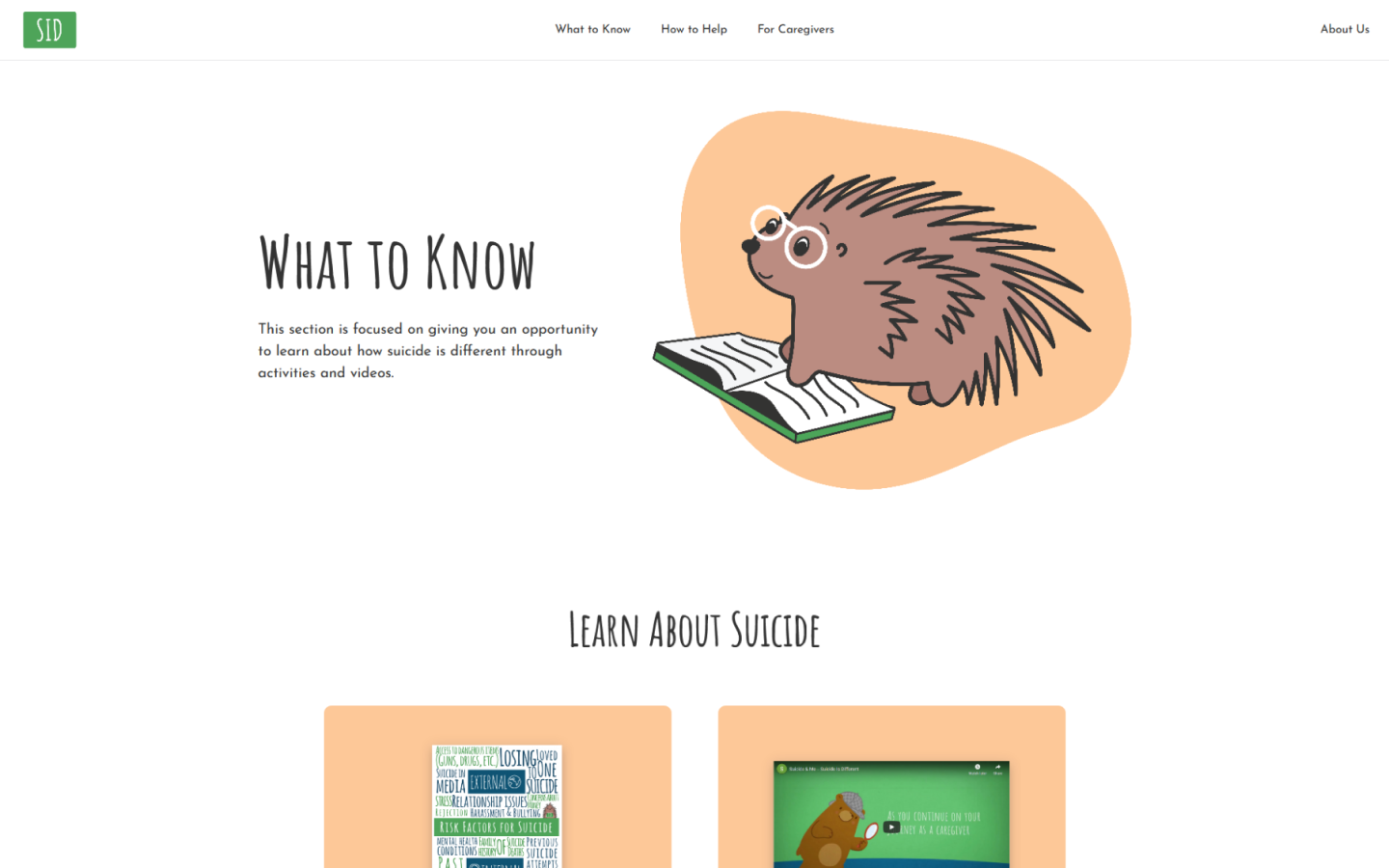
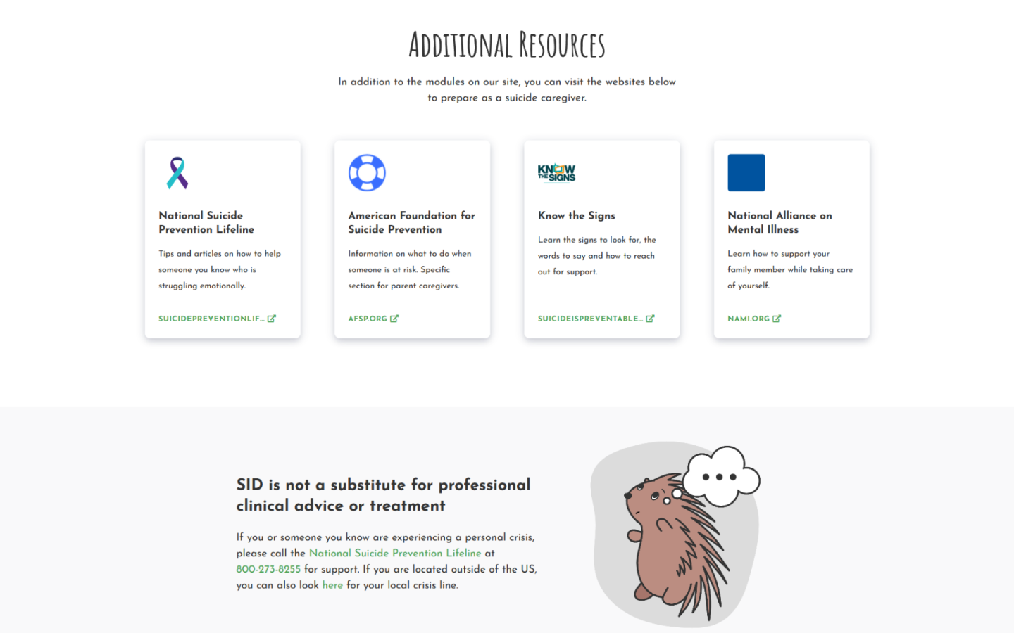
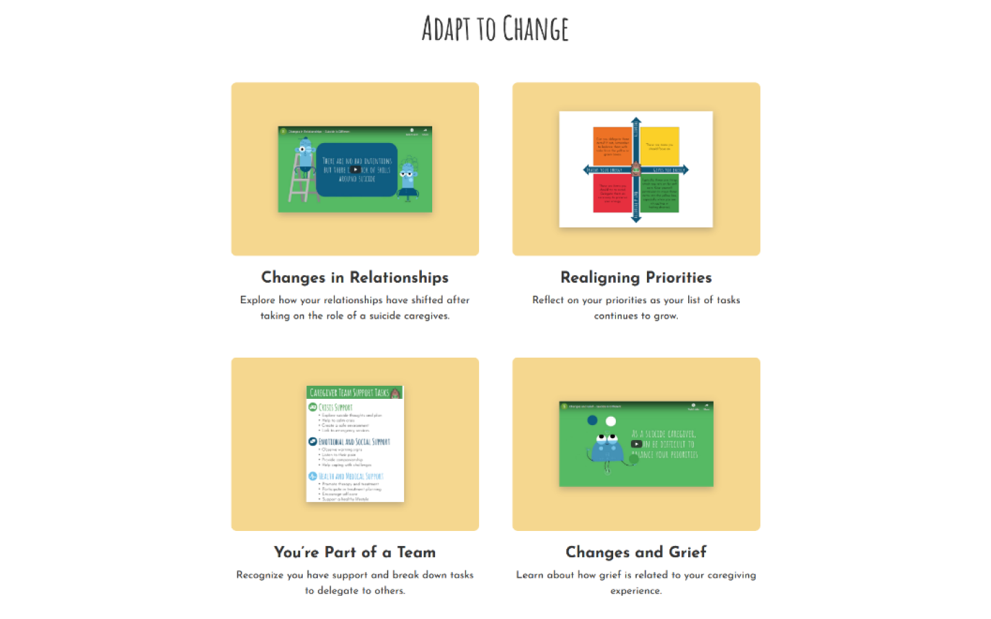
SID focuses on the touch points that occur after the initial crisis. Oftentimes, people who experience a crisis will likely experience it again. SID provides the tools and resources for those who want to provide long-time support.
The challenge was to figure out how we can map the crisis intervention experience. What tools do users need? What resources? The project's outcome was an IA overhaul, a defined style guide, and a redesigned website.
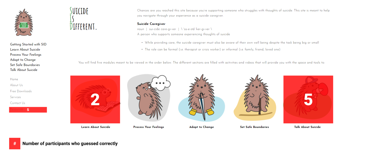
The original intent was to display suicide information in a 5 module sequence. Users would learn how to provide long-term support to people considering suicide.
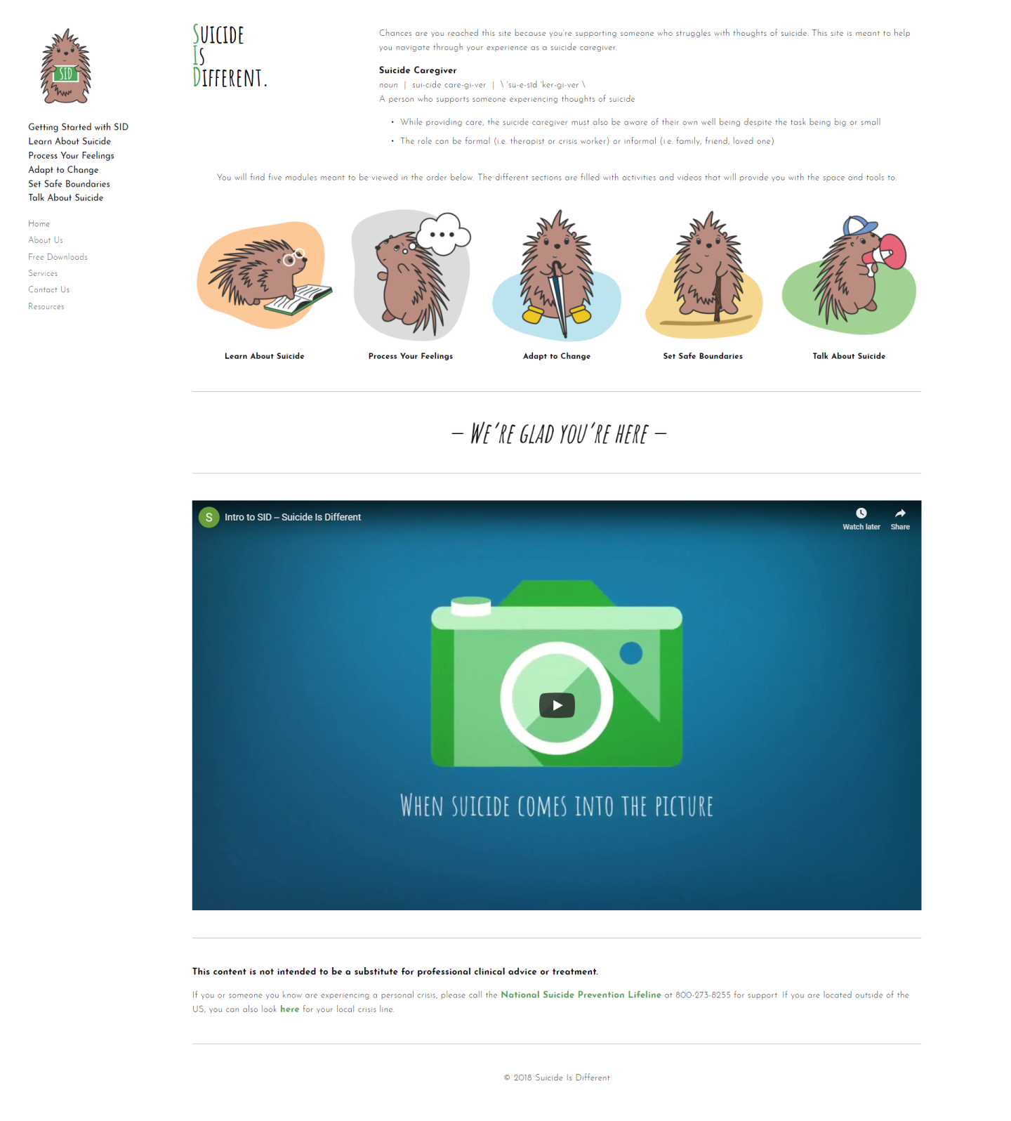
After 2 years, the clients didn't think users were getting the information they needed. Their analytics demonstrated a discrepancy in the user journey. There was high traffic at the beginning and end points of the 5-module sequence. This could mean that users weren't going in the intended journey. Additionally, the clients had no measurement for success. They weren't sure what content was most important, nor did they have a gauge on how people navigated the site.
Before we formed solutions, we wanted to learn how they got here. I reviewed their past research, and performed a heuristic evaluation. I identified potential usability issues, understood the workflow, and current information architecture.
In our research we facilitated a survey and an interview/usability test to: (1) learn about user types, (2) validate the initial user workflow, (3) identify use case, and (4) identify the most important content on the site.
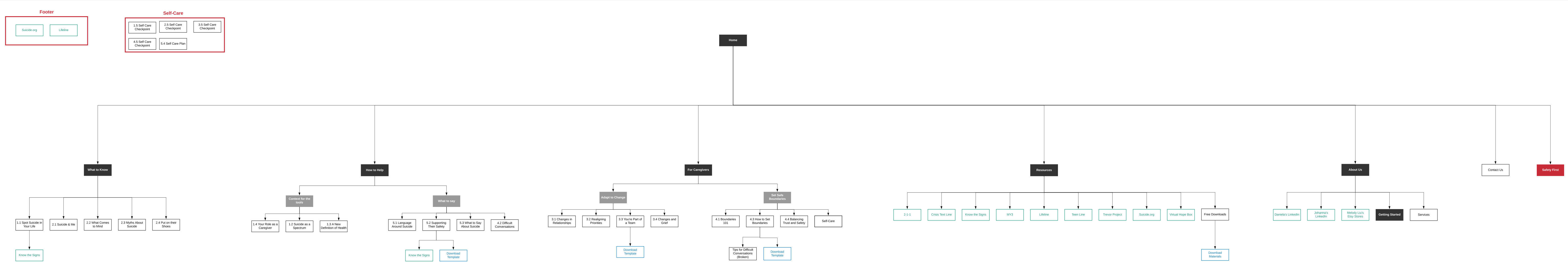
From our findings we created a new user journey, and revamped the information architecture.
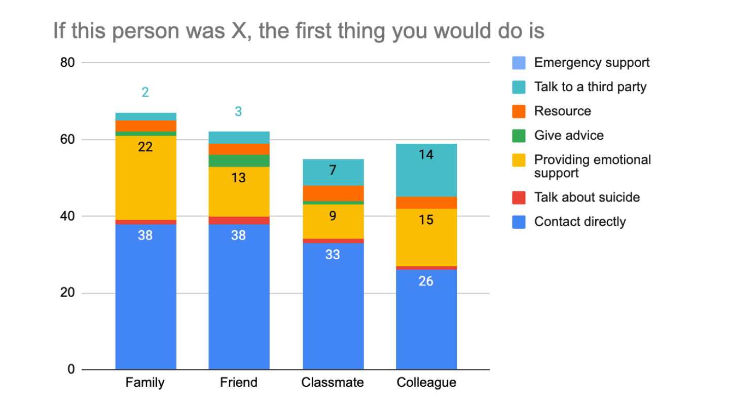
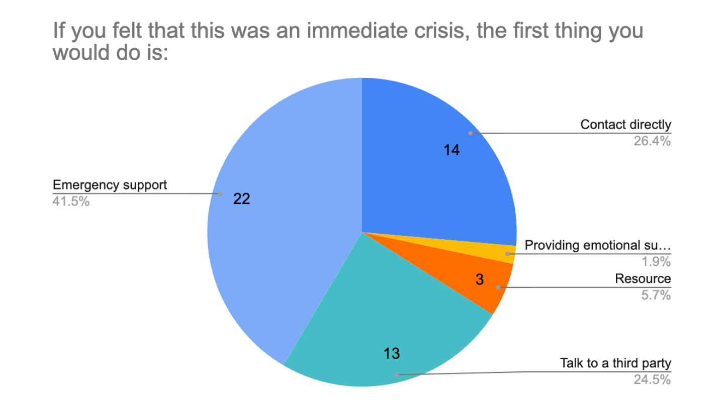
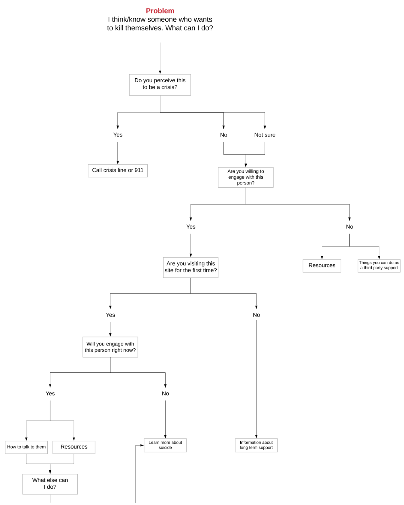
Our goals were to (1) match user's expectations on the landing page, and (2) increase scannability. I utilized our insights to create a new user flow. The user flow addressed immediate crises, and the most important content (figure 11). As a result, I also revamped the site's information architecture as well (figure 12).
Once we felt that our wireframes mappaed the new user flow, we created a prototype for testing. We wanted to (1) identify usability issues, (2) validate our new workflow, and (3) verify if users can differentiate between different patterns and components. While there were no crucial usability issues found, there were opportunities to improve content. We also validated our new user workflow, and new website components.
Years after launch the organization has shifted gears and updated their business model. While the more recent site's IA has changed, the templates and brand guide established at the onset is still being used to this day. It has helped them secure more consulting and collaboration opportunities. The custom solution was one-of-a-kind and could not be easily templatized through Squarespace.
First, I learned to craft questions based on our research goals. Doing this helps focus your facilitation, and helps you gather the data you actually need. For instance, asking irrelevant demographic questions increased the potential for survey fatigue. Cutting out those questions could have prevented participants from dropping our surveys.
Second, I wish I implemented other methods of discovery. I learned the most when I collaborated with the client. I wish I hosted workshop sessions to think through solutions with them. We could have done an affinity diagram together as opposed to completing it in isolation.
Lastly, I designed and developed the website through their Squarespace platform. Unfortunately, I didn't realize how limited Squarespace was. To ensure I could replicate my designs, I ended up coding everything. It worked out in the end, but it added more time in the development phase.